Step by step bootstrap tutorial for beginner
We design & develop free & premium Dashboard Templates in Bootstrap, Reactjs, Angular, Vuejs & many more that elevate your admin panel experience effortlessly.
Bootstrap is a CSS framework that allows developers to create websites for all kinds of devices. It offers templates based on HTML, CSS, as well as JavaScript. Initially, bootstrap designed by Twitter and developed for internal tools. In 2011 the framework was published on Github, wherein a very short period of time and with dozens of further developments, it became one of its most popular projects.
Why learn bootstrap?
Bootstrap is used to build an amazing and feature-rich website that is highly responsive.
• Easy to get started
• Responsive design
• Browser support
• Mobile-friendly approach
Why bootstrap catches developer Attention?
By implementing pre-designed HTML and CSS templates, web developers don't need to develop a good idea for a web page from scratch. Their modular structure allows easy integration into any HTML document. With this, many of the tedious CSS settings are eliminated, saving a great deal of time and effort.
This includes, among others, the following elements:
• Buttons
• Navigation elements
• Thumbnail view
• Dropdown menus
• Notices
• Record
• Responsive inclusion of videos
Another important aspect is the Bootstrap grid, on which the layout of a web page is built. This system facilitates the definition of the margins and the positioning of the elements that constitute a web page by distributing the layouts in 12 columns. To be able to use Bootstrap with JavaScript elements, you only need to include the jQuery library in the HTML document.
The bootstrap tutorial for beginners covers:
1.Visit Bootstrap's official website and download the “Bootstrap” pack, which contains CSS and JavaScript files (in a compiled and reduced version), as well as fonts and optional themes. 2.Unzip the file and copy the "Bootstrap File" to the desired directory.
•css - CSS code in readable format
•min.css - Reduced CSS code. Irrelevant content (such as spaces) has been removed to facilitate interpretation
•css.map - Contains CSS source maps, making it easy to find original data in LESS format
•bootstrap-theme.css - CSS files for pre-designed themes
•bootstrap-theme.min.css: reduced code for themes
•bootstrap -theme.css.map: theme source maps
•js: JavaScript code in a readable format
•min.js: reduced JavaScript code
The following sections will be your step by step guide to your first web development with Bootstrap.
- Include Bootstrap via CDN
- Write HTML5 boilerplate
- Include Bootstrap CSS
- Include Bootstrap JavaScript
- Add a navigation bar
- Add navigation links
- Add a dropdown
- Add a search form
- Add a content container
- Add a heading
- Add a table
- Add form elements to a table
- Add an alert message
1)Include Bootstrap via CDN
We will use CDN to enable bootstrap on-page. We will just include the Bootstrap CSS and JavaScript links on our web page.
2)Write HTML5 boilerplate
Create a new index.html. Open a file and place the code.
<!DOCTYPE html>
<html lang="en">
<head>

    <meta charset="utf-8">
    <meta http-equiv="X-UA-Compatible" content="IE=edge">
    <meta name="viewport" content="width=device-width, initial-scale=1">

    <title>Bootstrap Tutorial for Beginners</title>

    <!-- Bootstrap CSS will be here -->
</head>
<body>

<!-- navigation bar will be here -->
<!-- container bar will be here -->

<!-- Bootstrap JavaScript will be here -->

</body>
</html>
The output will be shown like this:

Check the source, it’s different from the previous one:
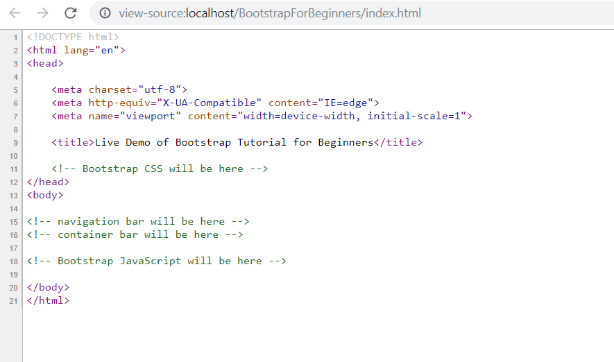
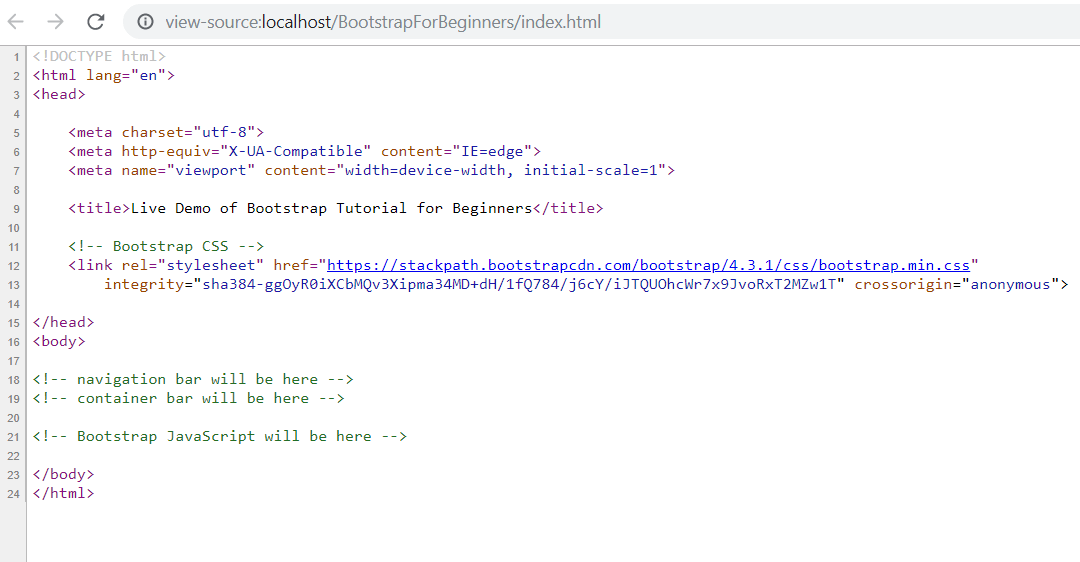
3) Include Bootstrap CSS
On the index.html file, replace with the following code.
<!-- Bootstrap CSS -->
<link rel="stylesheet" href="https://stackpath.bootstrapcdn.com/bootstrap/4.3.1/css/bootstrap.min.css"
        integrity="sha384-ggOyR0iXCbMQv3Xipma34MD+dH/1fQ784/j6cY/iJTQUOhcWr7x9JvoRxT2MZw1T" crossorigin="anonymous">
The integrity and crossorigin attributes are needed for security purposes.
Check the output.
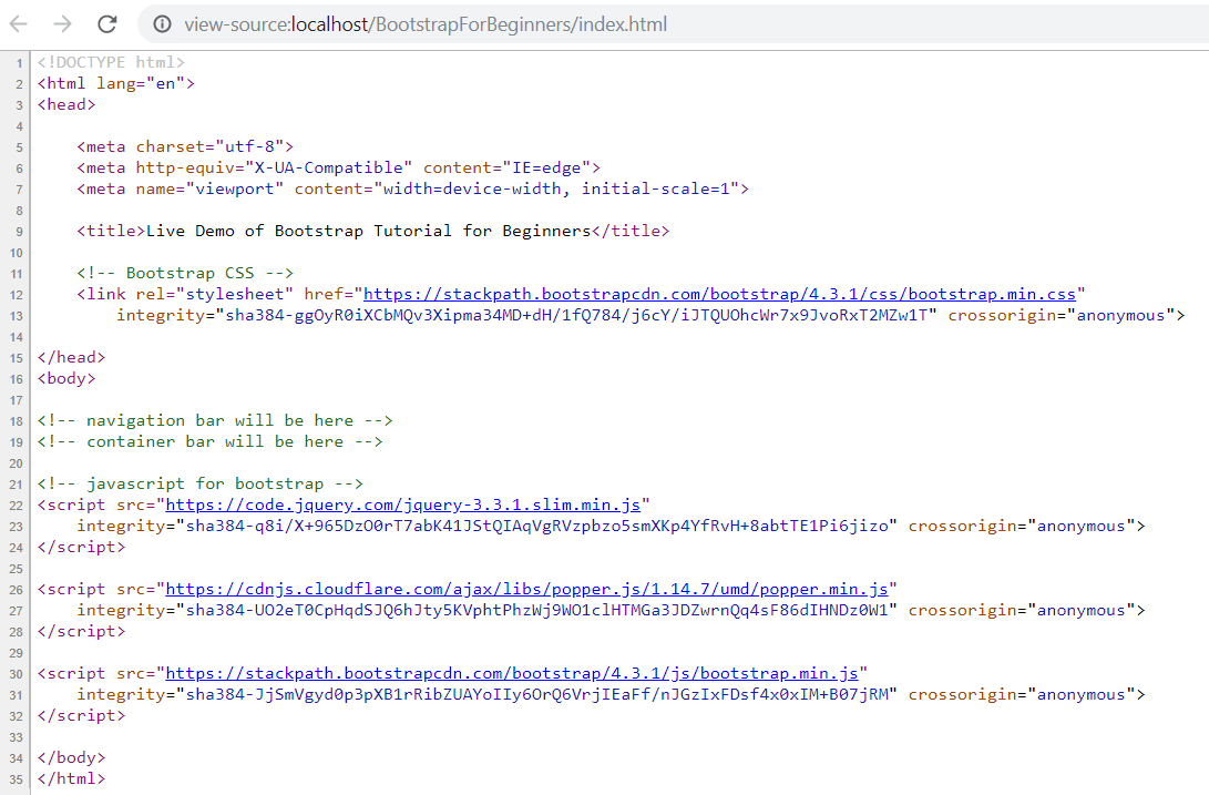
4)Include Bootstrap JavaScript
Bootstrap features like the navigation bar need the Bootstrap JavaScript file. On the index.html file, replace with
<!-- javascript for bootstrap -->
<script src="https://code.jquery.com/jquery-3.3.1.slim.min.js"
    integrity="sha384-q8i/X+965DzO0rT7abK41JStQIAqVgRVzpbzo5smXKp4YfRvH+8abtTE1Pi6jizo" crossorigin="anonymous">
</script>

<script src="https://cdnjs.cloudflare.com/ajax/libs/popper.js/1.14.7/umd/popper.min.js"
    integrity="sha384-UO2eT0CpHqdSJQ6hJty5KVphtPhzWj9WO1clHTMGa3JDZwrnQq4sF86dIHNDz0W1" crossorigin="anonymous">
</script>
The output will be shown:
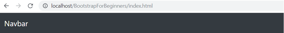
5) Add a navigation bar
Bootstrap contains a really handy navigation component called Navbar. Its main features and advantages are:
•It automatically collapses on smaller viewports (typically mobiles and tablets). You control this behavior only by adding or removing a simple HTML class. Also, a pre-made button appears automatically to open the navbar in the collapsed state on smaller devices.
•It can contain various elements - navigation links, search form, brand logo, or text. Everything will be aligned properly and you don't need to think about it.
•Bootstrap comes with two pre-made navbar designs - one with a light background and dark links and the second one with light navigation links on a dark background.
<!-- navbar -->
<nav class="navbar navbar-expand-lg navbar-dark bg-dark">
    <a class="navbar-brand" href="#">Navbar</a>
    <button class="navbar-toggler" type="button" data-toggle="collapse" data-target="#navbarSupportedContent"
        aria-controls="navbarSupportedContent" aria-expanded="false" aria-label="Toggle navigation">
        <span class="navbar-toggler-icon"></span>
    </button>
   <!-- navigation links will be here -->
</nav>
<!-- /navbar -->
The output will be shown like this:
Main navbar element In the beginning, I create the navbar from the nav element by adding a class= "navbar" to it. This is the main navbar class.
I also add a few modifier classes to it:
•navbar-light - this modifier class triggers the pre-made design for light navbars - basically, it colors the links and their active, hover, focus states.
•navbar-expand-lg - an important class that controls on which viewports will navbar be collapsed and from which viewports it will be expanded (i.e., no hamburger menu icon and collapsed navbar menu). In this case, class navbar-expand-lg means that the navbar will be expanded on lg+ viewports.
•fixed-top - this class affixes the navbar on the top of the screen. Don't include it and the navbar will not scroll with the page.
•and lastly, few so-called utility classes that do not control the function but are used just for styling purposes - shadow-sm (adds a small shadow) and bg-white (adds a white background)
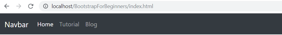
6) Add navigation links
On index.html file, replace with
<div class="collapse navbar-collapse" id="navbarSupportedContent">
    <ul class="navbar-nav mr-auto">
        <li class="nav-item active">
            <a class="nav-link" href="index.html">Home <span class="sr-only">(current)</span></a>
        </li>
        <li class="nav-item">
            <a class="nav-link" href="https://www.codeofaninja.com/2014/05/bootstrap-tutorial-beginners-step-step.html" target="_blank">Tutorial</a>
        </li>
        <li class="nav-item">
            <a class="nav-link" href="https://www.codeofaninja.com" target="_blank">Blog</a>
        </li>
        <!-- drop down will be here -->
    </ul>
    <!-- search form will be here -->
</div>
The output will be shown like this:
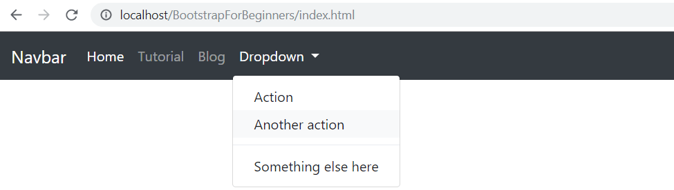
7) Add a dropdown
On index.html file, replace with
<li class="nav-item dropdown">
    <a class="nav-link dropdown-toggle" href="#" id="navbarDropdown" role="button"
        data-toggle="dropdown" aria-haspopup="true" aria-expanded="false">
        Dropdown
    </a>
    <div class="dropdown-menu" aria-labelledby="navbarDropdown">
        <a class="dropdown-item" href="#">Action</a>
        <a class="dropdown-item" href="#">Another action</a>
        <div class="dropdown-divider"></div>
        <a class="dropdown-item" href="#">Something else here</a>
    </div>
</li>
The output will be shown like this:
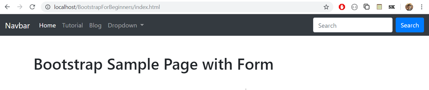
8) Add a search form
On index.html file, replace with
<form class="form-inline my-2 my-lg-0">
    <input class="form-control mr-sm-2" type="search" placeholder="Search" aria-label="Search">
    <button class="btn btn-primary my-2 my-sm-0" type="submit">Search</button>
</form>
The output will be shown like this:

9) Add a content container
A bootstrap container makes the website responsive. On the index.html file, replace with
<div class="container mt-5">
    <!-- heading will be here -->
    <!-- alert will be here -->
    <!-- table will be here -->
</div>
You can replace the class container with a container-fluid if you want the container to have full width. Nothing has changed on our output. But if you will view the source, you can see the div tag with a container class.
10) Add a heading
On the index.html file, replace with
<div class="row">
    <div class="col-sm">
        <h1>Bootstrap Sample Page with Form</h1>
    </div>
</div>
The output will be shown like this:
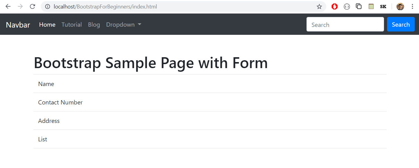
11) Add a table
Bootstrap Table will hold form elements like a text box. On index.html file, replace with
div class="row">
    <div class="col-sm">

        <table class='table table-hover'>

            <tr>
                <td>Name</td>
                <td></td>
            </tr>

            <tr>
                <td>Contact Number</td>
                <td></td>
            </tr>

            <tr>
                <td>Address</td>
                <td></td>
            </tr>

            <tr>
                <td>List</td>
                <td></td>
            </tr>

            <tr>
                <td></td>
                <td></td>
            </tr>

        </table>

    </div>
The output will be shown like this:
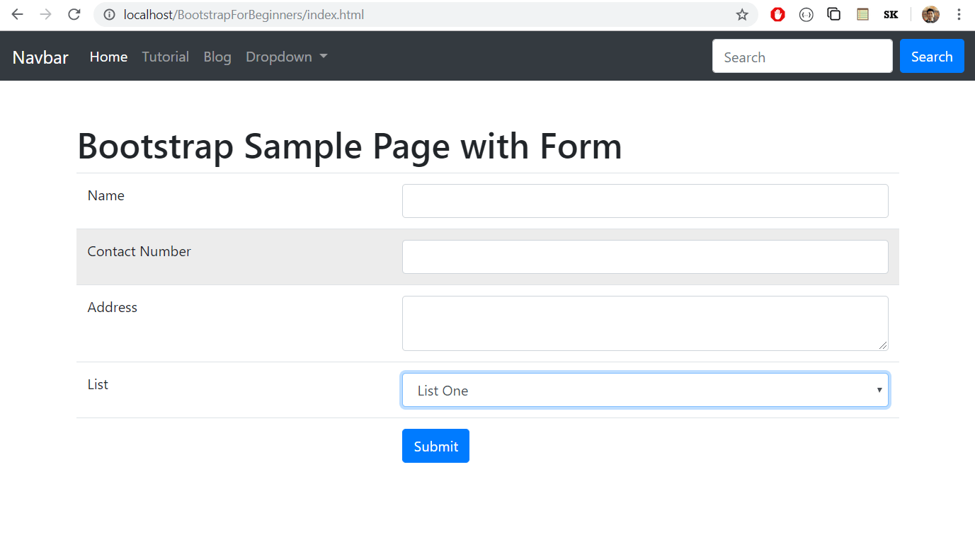
12) Add form elements to a table
Our Bootstrap Form example will have a few text boxes, a text area, a select drop-down list, and a submit button.
<form action='#' method='post'>
    <table class='table table-hover'>

        <tr>
            <td>Name</td>
            <td><input type='text' name='name' class='form-control' required></td>
        </tr>

        <tr>
            <td>Contact Number</td>
            <td><input type='text' name='contact_number' class='form-control' required></td>
        </tr>

        <tr>
            <td>Address</td>
            <td><textarea name='address' class='form-control'></textarea></td>
        </tr>

        <tr>
            <td>List</td>
            <td>
                <select name='list_id' class='form-control'>
                    <option value='1'>List One</option>
                    <option value='2'>List Two</option>
                    <option value='3'>List Three</option>
                </select>
            </td>
        </tr>

        <tr>
            <td></td>
            <td>
                <button type="submit" class="btn btn-primary">
                    <span class="glyphicon glyphicon-plus"></span> Submit
                </button>
            </td>
        </tr>

    </table>
</form>
The output will be shown like this:
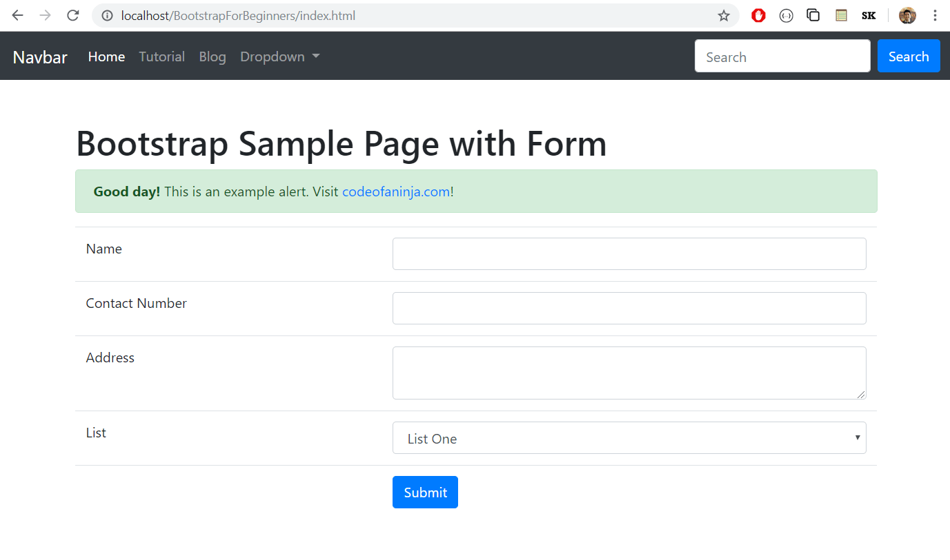
13) Add an alert message
Bootstrap Alerts are a nice way to get your user's attention. On index.html file, replace with
<div class="row">
<div class="col-sm">
        <div class="alert alert-success">
            <strong>Good day!</strong> This is an example alert. Visit <a href="https://codeofaninja.com/" target="_blank">codeofaninja.com</a>!
        </div>
    </div>
The output will be shown like this:
Conclusion
I hope you learned the basics of bootstrap and how to create and implement functionality in bootstrap. To build a professional website that is highly feature-rich use a bootstrap admin template that makes easy development work.


